TM-30: The New Standard In Color Rendering - Targetti

Because Great Design Deserves Color Accuracy.

CRI rates color. TM-30 reveals it. Know the difference.

Experience color quality in action through a visual demonstration that shows why TM-30 provides a more complete picture than CRI alone.

CRI has long been used to evaluate lighting quality, but it doesn’t fully reflect real-world color perception. TM-30, developed by the IES, offers a more complete approach with detailed metrics for fidelity and saturation, giving designers greater confidence in color performance.

A Commitment to TM-30

Targetti USA recognizes the value of IES TM-30 as an accurate measurement of light color quality. We include TM-30 information on all our product specification sheets, providing designers and specifiers with upfront metrics to accurately determine the light source and design with confidence.

Each TM-30 Information Table includes:
• CCT (Correlated Color Temperature)
• CRI (Color Rendering Index)
• Rf (Fidelity Index)
• Rg (Gamut Index)
• R9 (Strong Red Rendering)
• Duv (Distance from the Blackbody Curve)
• SDCM (Color Consistency)

In addition, each specification sheet provides relevant LED and lumen output information, ensuring complete transparency into the performance characteristics of every fixture.

CRI vs. TM-30 — What’s the Difference?

CRI (Color Rendering Index) — a single color fidelity score that indicates how colors appear compared to a reference source. TM-30 goes beyond color fidelity to capture the complete visual experience. It is the next evolution in color evaluation.

CRI — The Traditional Standard
Color Rendering Index (CRI) measures how accurately a light source renders colors compared to a reference source. While widely recognized, CRI evaluates only a limited range of color samples and does not fully represent how light performs in real-world environments.

Pros
• Simple and widely understood
• Easy specification benchmark
• Useful for general color accuracy evaluation

Limitations
• Based on only 8 color samples
• Does not evaluate color saturation or fidelity fully
• Can overlook visual nuances in architectural applications

TM-30 — A More Complete Approach
TM-30 expands color evaluation by analyzing 99 color samples and providing deeper insight into both color fidelity and color gamut. The result is a more accurate representation of how light interacts with materials, textures, and architectural finishes.

Benefits
• Evaluates a broader spectrum of colors
• Measures both fidelity and saturation
• Provides more realistic visual performance data
• Better suited for modern architectural lighting design

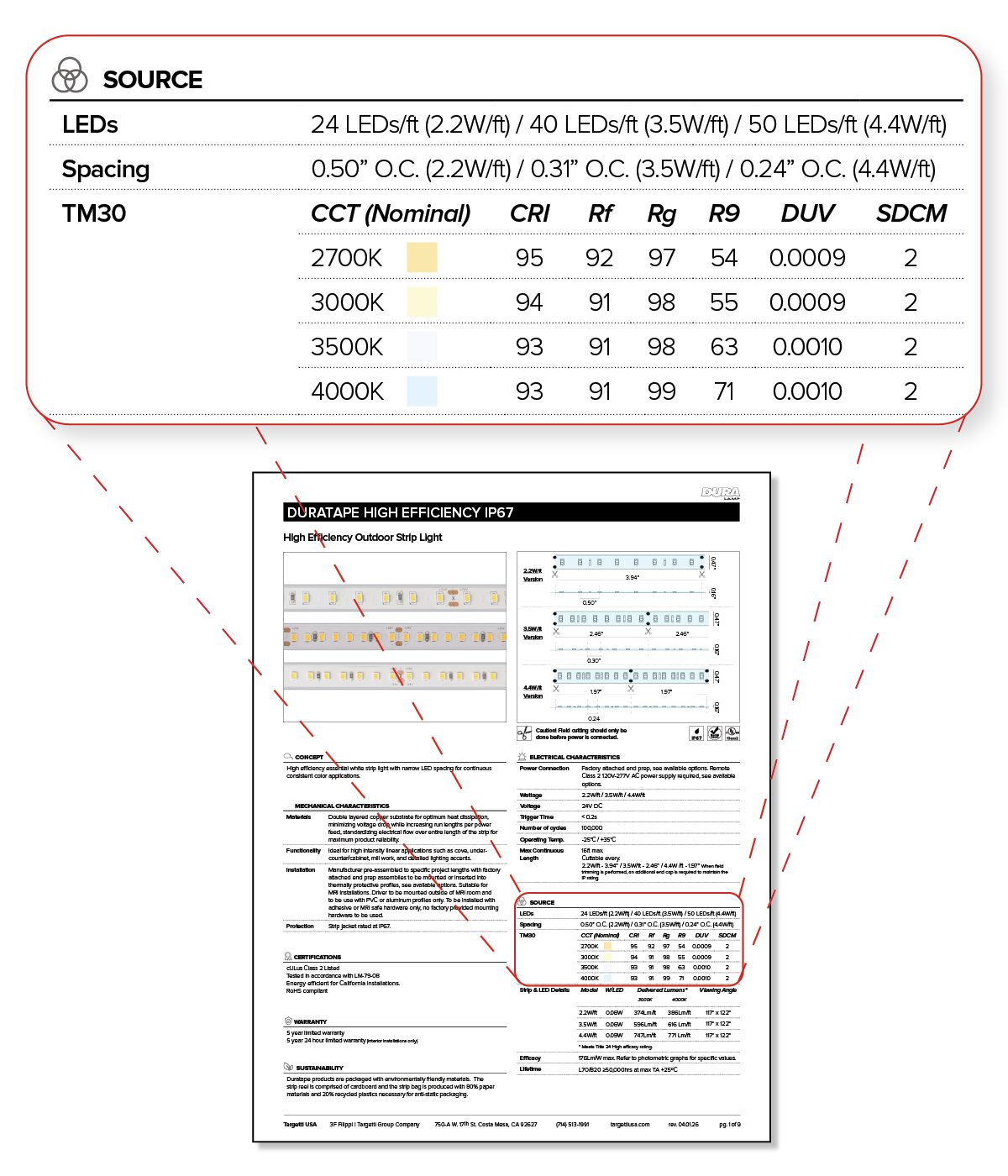
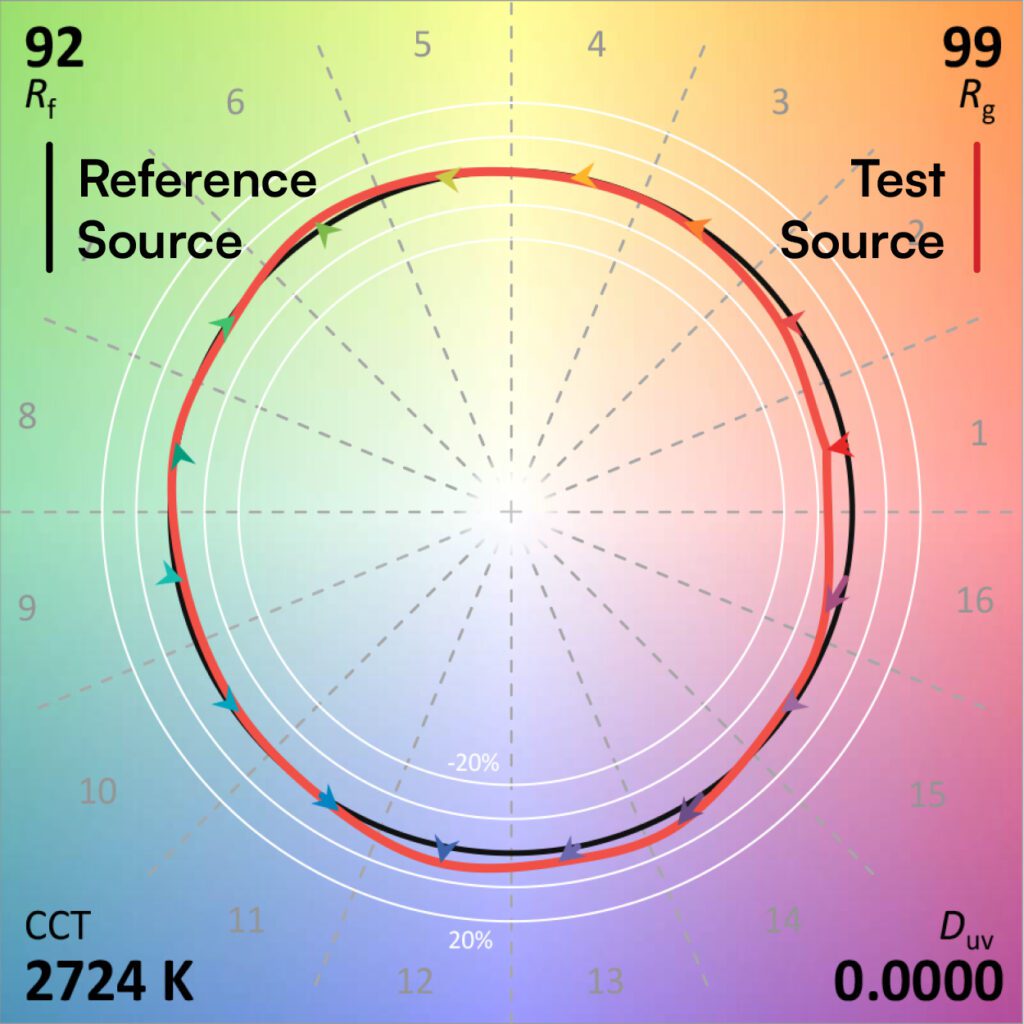
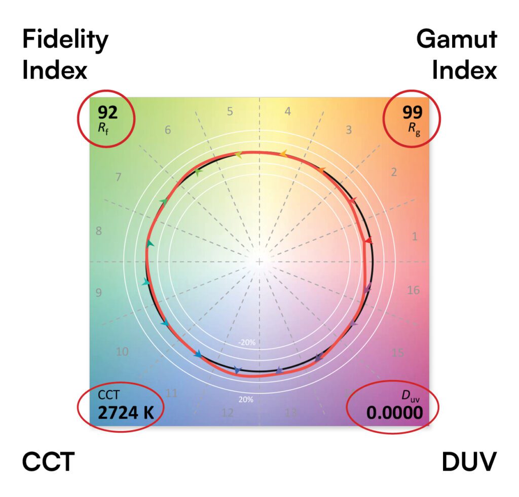
How to Read a TM-30 Color Vector Graphic (CVG)

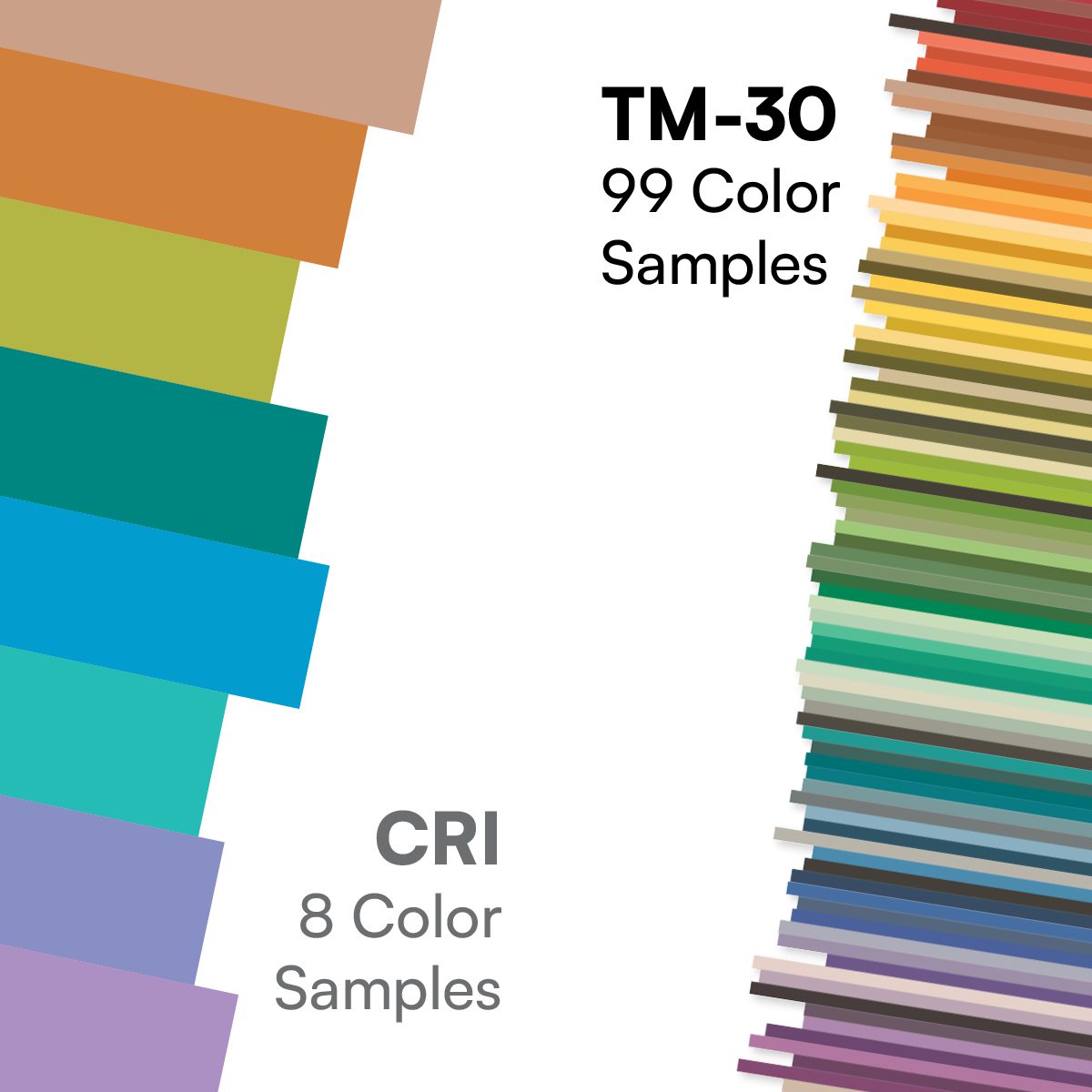
The Color Vector Graphic provides a quick visual snapshot of how a light source affects the appearance of colors.

The Black Circle
Represents natural, balanced color appearance and serves as the reference point.

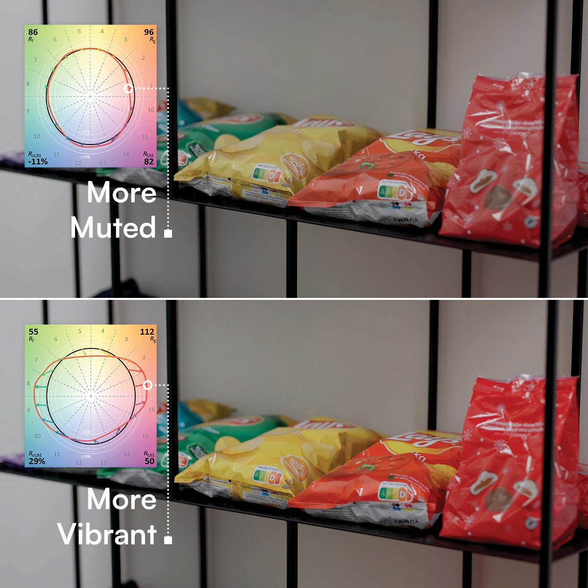
The Colored (Red) Shape
Shows how the tested light source renders colors compared to the reference.
• If the shape closely follows the black circle, colors will appear more natural and accurate.
• If the shape extends outside the circle, colors may appear more vivid or saturated.
• If the shape falls inside the circle, colors may appear softer or less vibrant.
• Uneven shapes indicate that some color families are enhanced while others are muted.

The closer and more balanced the colored shape is to the black circle, the more consistently colors will appear throughout the space.

Correlated Color Temperature (CCT)
Indicates the warmth or coolness of the light source, measured in Kelvin (K). Lower values appear warmer, while higher values appear cooler and more daylight-like.

Duv (Distance from the Blackbody Curve)
Duv indicates whether the light appears slightly green or slightly pink/magenta compared to an ideal white light source at the same CCT.
• Duv = 0.000 → Exactly on the blackbody (Planckian) curve.
• Positive Duv (+) → Slight green/yellow tint.
• Negative Duv (-) → Slight pink/magenta tint.

The 3 Color Shifts to Look For

Looking at the red line on the Color Vector Graphic (CVG). Its position relative to the black circle tells you exactly how colors will change under that light source:

Bulging Outward (Vibrant):
Over-saturates colors to make them pop and look intensely vivid.

Shrinking Inward (Muted):
Under-saturates colors, making your space look dull, washed out, or grayish

Shifting Sideways (Hue Shift):
Changes the actual shade, causing colors to drift (e.g., pure red looks orange

The 4 Big Metrics to Check

Fidelity Index:
Scale of 0–100. Measures overall color accuracy. Look for 90+ for high-end spaces.

Gamut Index:
Baseline is 100. Higher than 100 means colors look more vivid. Lower than 100 means colors look more muted.

Correlated Color Temperature (CCT):
CCT, tells you the color temperature of the light source (e.g., 2700K for warm candlelight, 5000K for crisp daylight).

Duv:
Measures distance from perfect white light. A value of 0 is perfect. A positive (+) value shifts slightly green, while a negative (-) value shifts slightly pink/magenta.

Beyond CRI: Seeing Light Quality with TM-30


TM-30 is richer and more accurate— showing not just similarity to reference but how colors shift in saturation and hue.

Together, fidelity (average fidelity) and saturation (red chroma) tell you not just if colors are accurate, but how they look in real spaces.

But what about how light feels — not just how accurate it is?

Preference” and “Vividness” are directly related. Research shows that people tend to prefer and increase in vividness or saturation.

Preference is not a score, rather prediction using:
• Rf (Fidelity Index) – accuracy
• Rg (Gamut Index) – overall saturation
• Hue-specific data (Rcs,h1) – red saturation

While Vividness = Saturation behavior

The most visually pleasing light is accurate, but red enhanced.
Research from the Illuminating Engineering Society indicates people prefer lighting with strong, slightly elevated saturation, and subtle red enhancement without hue distortion.

The Simple Difference

Two lights can have the same CRI —
But one may make reds pop, and the other makes reds dull.
CRI won’t tell you that.
TM-30 will.

Tell Me More